Where should I look? The Boston Globe's website is so disorganized and busy that it distracts the reader. Advertisements clutter the already overcrowded landscape of the website.
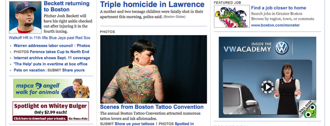
The large amount of content is impressive, but having every story on the home page is intimidating. Categories are featured on the top and bottom of the page, but they do not seemed to be utilized correctly. The page is also very unorganized. The top sports story sits next to a news story, above a picture of a tattoo convention. I can barely tell what story is connected to what graphic.
The design also makes it hard to tell what is an advertisement, and what is a graphic. The Boston Globe's website has more ads than video and pictures. I read multiple stories that were great reads, but not one had a pictures, graphics, audio, or video.
This website comes off more as a commercial site than a news site. I feel like they are trying to sell me products, not tell me the news. They have sections such as "featured job," "weekly ads," and "today's deal." It does not feel professional.
I did like the "Hot Topics" bar featured at the top of the screen. It was the only way to have some look into what the big stories of the day were, instead of searching through the site in hopes of picking them out of the mess.
I also appreciated how quickly the site was updated. Late last night Triple homicide in Lawrence had less information, and today it reads Mother, 2 teenagers killed in Lawrence and has a photo of mourners.
Better organization, a focus on multimedia content, and less advertisements would bring Boston.com more online readers and a finished look. Currently, too much information on the home page makes

 RSS Feed